- So what are the ways to find the right type?
- Variable Fonts
- Handwriting Lettering
- Watercolor Fonts
- B&B - Big And Bold
- Custom Typefaces
- Geometric Fonts
- Mix It Up- Font Duo
- Text Over Images
- Image Over Text
- Responsiveness
- A quick wrap-up
It may sound weird, but there are plenty of studies on the psychology of typography. Every day you see hundreds of modern websites, Instagram or Facebook posts, personal or corporate blogs, online magazines, etc.and you don't even realize the difference that the right font can make. If chosen wisely, the lettering can improve the readability, increase the number of clicks and even drive more conversions.
So what are the ways to find the right type?
- Buy one you like from the marketplace
- Try to draw your own one
- Download the free fonts available on the Net
- Find a designer to create a custom one for you
- Use Google fonts
Luckily, there are tons of useful resources where you can find the right solution. But it is still hard to find which one will make your works one-of-a-kind.
Why is it important to know what’s on trend right now?
Everything is simple. Nowadays, it is extremely important to stay relevant.
It’s time to forget about the hackneyed Arial, Comic Sans and Papyrus typefaces. Regarding the last one, do you remember the ‘Avatar’ movie? The thing is that they used a ‘Papyrus’ font for the logo. Yeah, in 2009, for the multi-billion dollar blockbuster. It sounds kind of weird, right?
It went so viral, that a brilliant skit from an episode of Saturday Night Live appeared:
We will help you avoid such mistakes. That is why it’s time to take a look at the most trendy typography solutions of 2017.
Variable Fonts
Thanks to the OpenType 1.8 release, new opportunities have appeared. Imagine that a single font can be viewed in multiple ways. Well, with the Variable one, everything is possible. It allows you to adjust the letter size, according to your needs. Customize the width axis or the weight axis, shorten the descenders. In addition, it prevents the file size from increasing. So consider using them if you want to try out their real flexibility.

The Dunbar
Handwriting Lettering
Handwritten typefaces allow you to create truly stylish layouts. It is no surprise that trendy calligraphy will be the icing on the cake for Instagram posts, websites, personal blog or even printed material. By using hand drawn elements you can evoke different feelings. For example, for a beauty blog, you can use tender and curly lettering. It will create a warm and welcoming atmosphere.
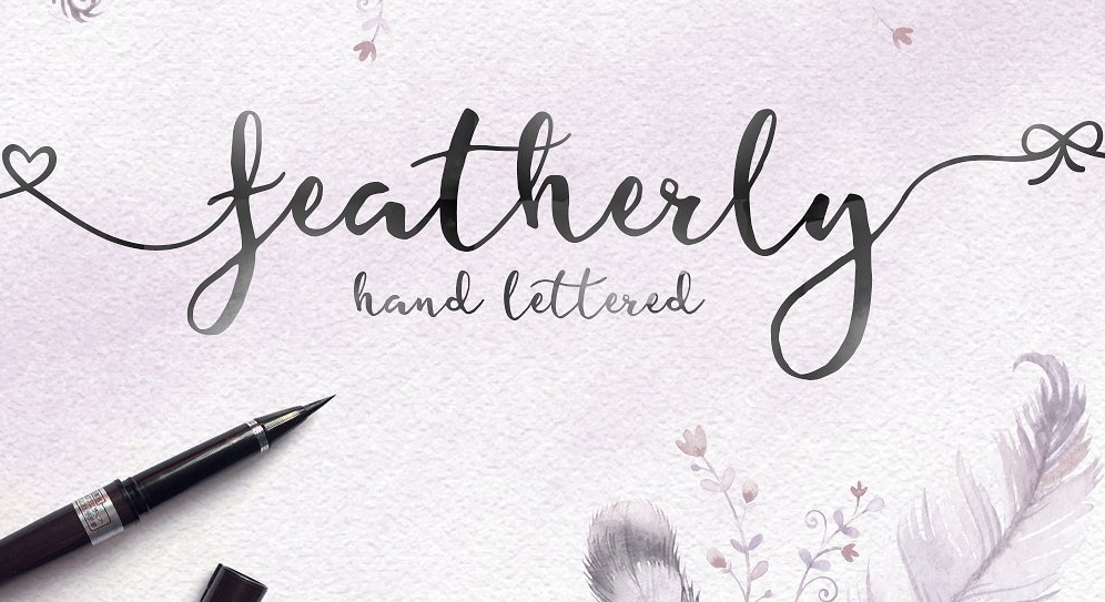
Featherly by Joanne Marie
Watercolor Fonts
The watercolor design is a rather creative tool for those who want to stand out from the crowd. Beautiful typography, like this one, invokes comfortable and friendly feelings and increases the trustworthiness. It is a great option for creating Instagram posts, a logo or a website design. Moreover, watercolor calligraphy would be a perfect fit for greetings cards. Add a personal touch to your layouts by using this trendy feature.
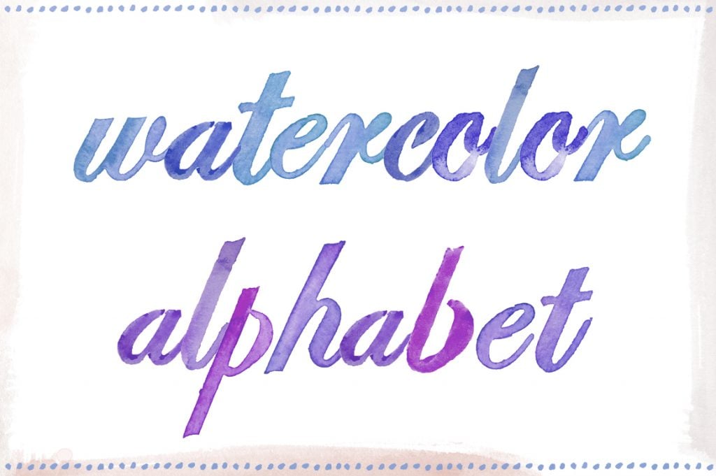
Watercolor Alphabet by Angiemakes
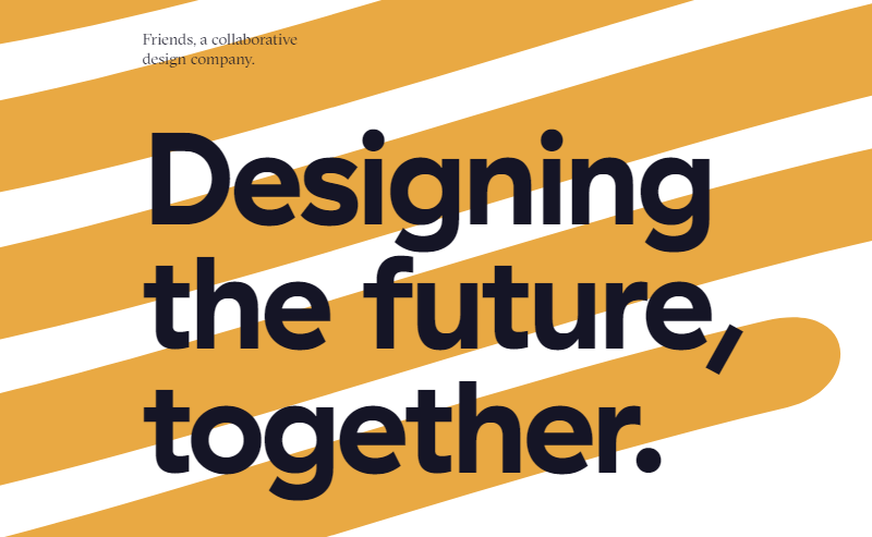
B&B - Big And Bold
Bold lettering is a great option to underline the necessary text elements. If you want to transmit a clear and powerful message, make it bigger. The big and bold text is a great example of an attention-grabbing element. But remember that balance is a must. It is essential to leave sufficient blank space near such oversize content blocks. Here is how Friends design agency used this trick for their homepage:
Custom Typefaces
Custom typography provides you with incredible flexibility. Certainly, creating one requires time and money. But the result is worth it. By using a custom type you can underline the personality of your brand. If you want to highlight specific features of your business or niche, you can incorporate all these ideas in the typeface. Show your individuality through the font, like.

1md, a creative bureau, who used a custom font for their website.
Geometric Fonts
The following trend has remained relevant over the past few years. A geometric inscription is a great option not only for websites and Instagram posts. It would also be a fit for album covers and movie posters. The geometric shapes of the letters remind us of both the runic alphabets and futuristic designs at the same time. So if you want to add some intrigue into your layout, use this kind of font type.

The High Tide free font.
Mix It Up - Font Duo
Using a single font for your website is normal. It is a choice of those who love minimalist layouts. But if you are a creative person, the following approach may sound boring to you, so we suggest you break the rules and mix different fonts. The combination of several typefaces is a powerful eye-catching tool. The following trend lets you create a stunning visual representation of your brand.
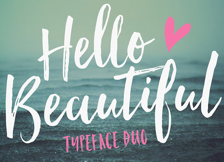
Hello Beautiful duo by Nicky Laatz
Text Over Images
The text over image concept may sound pretty simple. You choose the photo and then overlay your text on it. Sure, you can just use a black background and put a white slogan on it, that’s classic. But combining the photo and text can increase the effectiveness of your message. The type over image allows you to create contrasting designs. Just make sure that you pick the right color scheme for your printing.
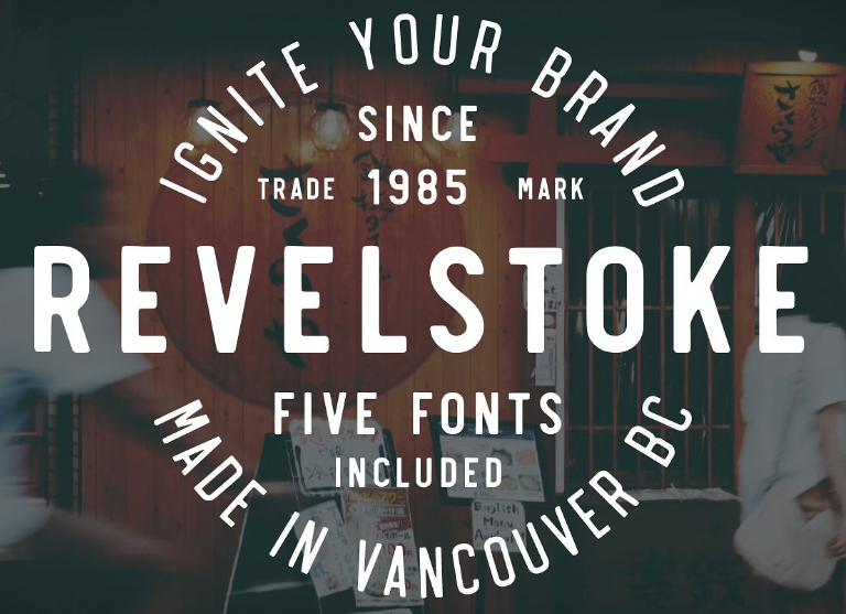
Revelstoke 5 font family by Greg Nicholls
Image Over Text
The image over text is popular among graphic designers, photographers and web design companies. This visual effect is created by adding a double exposure. A novel approach like this allows you to showcase an image right in your text. Using the image over text trend can make your content memorable. It will be one of those fonts that play an important role in the overall project perception.

Responsiveness
Don’t forget about the responsiveness. Remember that it is a must-have feature for your website, so it is extremely important to pick a type that will look equally good on any device. To meet these requirements, consider using lettering that will be easy-to-read on a smartphone or a tablet. According to many resources, the San Serif Fonts give the best performance on mobile devices.

A quick wrap-up
You always have a choice between the timeless classic and modern features. You can follow the popular proven methods or become a trendsetter, it’s up to you. Everything depends on your taste and business goals. Which typography trends do you think will stay relevant in 2018? You are welcome to share your opinion in the comment section below. By the way, there is a pack of beautiful font solutions on our website, so you can take a look at them and choose the one that suits your needs.
Related Posts
Significance of Typography in Design
Rules for Creating the Best Typography
The Forgotten Basics of Website Typography
Fonts to Add to Your Cursive Typography Collection
10 Typography Trends to Stick to in 2017
The post Examples Of Top 10 Beautiful Typography Design Trends 2018 appeared first on MonsterPost.